Designed to Engage.
Innovating work tools.
Master your communications to sell, market, convince and collaborate better. Expand your ways to make impact and communicate your brand.
Unleash the Power of Your Tools
See best practices
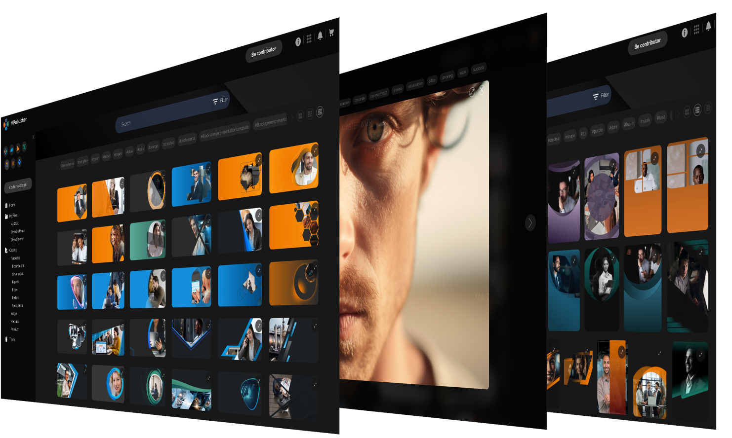
Tools worth Applying
MASTER WiZR makes it easy to improve everyday communication, hold impactful meetings, build deeper connections, and create a strong virtual presence