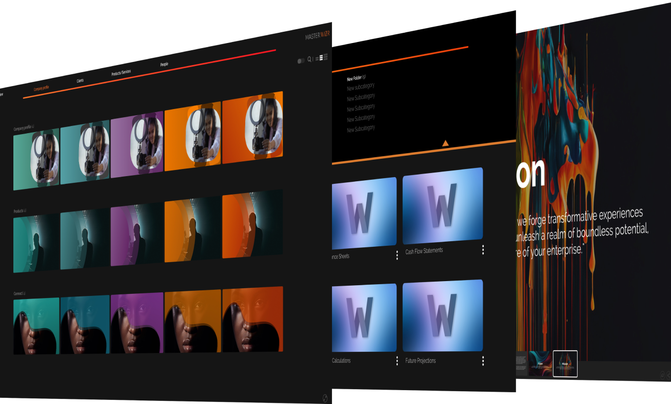
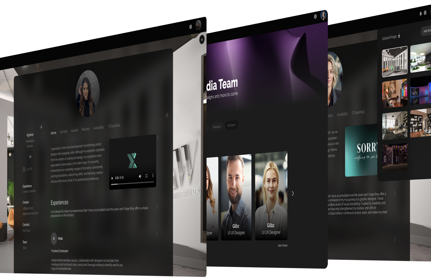
Keeping up with design trends in your presentations

Dec 08, 2022 Visuals and Designtest


Express
Yourself

Gone are the days of dull presentations. As the design world has evolved, so have presentation trends. The right design can help you wow your audience and leave a lasting impression. 


Typography

The right font can make a big difference in your presentation. Try mixing and matching different fonts to create a visually interesting aesthetic. Consider pairing a modern font with a classic serif font to give your presentation a timeless look and feel. According to Smashing Magazine,Its important to remember that the combination of fonts you choose will have a major impact on the overall look of your presentation.

Typography is an essential part of presentations because it helps to create a visual hierarchy and adds emphasis to key points. It can also help to create a stronger brand identity, as well as set the tone for the overall message. According to The Balance Careers,Its important to create a hierarchy of information in a presentation, which is where typography is so useful.

Here are our top picks:

  •  Raleway
  •  Bangers
  •  Poppins
  •  Roboto
  •  Montserrat

By making some of the text bigger and more prominent, your audience will be able to instantly spot the most important message and details. In addition, according to Venngage, typographycan create a unique visual identity that helps to draw audience attention. A consistent typographic system can help create a visual connection between different slides and will help your presentation look more professional.” Overall, typography plays an important role in creating effective presentations.


Contrasting colors

Secondly, incorporating contrasting colors is a great way to create a visually stimulating design. This could mean contrasting dark and light shades, or complementary colors such as blue and orange. Alternatively, you could also experiment with gradient color palettes, which add make the design more engaging. Contrasting colors can be extremely beneficial for presentations.

Here are our top picks:

  • Teal and Mustard
  • Orange and Turquoise
  • Burgundy and Sage Green
  • Black and Orange
  • Black and White

According to the Color Matters website, using contrasting colors can help draw the audience’s attention to the most important elements of the presentation. Additionally, it can help ensure that the text and visuals on the slide are legible and easily visible. Using high-contrast colors can also increase audience attention and engagement with the presentation, keeping them focused and interested throughout. Using contrasting colors when choosing a presentation theme can create visual appeal, making the presentation look more interesting and professional. Finally, creating contrast between text and backgrounds can help to reduce the amount of eyestrain among the audience, which can help to ensure that the presentation is enjoyable and successful.


Animation

Thirdly, adding animation to your presentation can be an effective way to grab your audiences attention. Animations can help to illustrate complex concepts, and can often be used to emphasize key points. They can also be used to transition between slides, creating a more dynamic feel.

Here are our top picks:

  • Parallax Animations
  • Bounce Animations
  • Fadein and Fadeout Animations
  • Rotate Animations
  • Zoom Animations

Animations and transitions are a great way to add interest and movement to a static presentation. Use subtle animations to emphasize key points or use transitions to move from one slide to the next in a smooth, eye-catching way. According to the design firm Mokah, “Animations and transitions are incredibly valuable for guiding viewers to focus on core elements of the presentation.”


Abstract Illustrations

Fourthly, you can also make use of abstract illustrations to add interest and visual appeal to your presentation. Abstract illustrations can be used to illustrate complex concepts, or to add a playful feel to your design. By using abstract illustrations, you can create a presentation that is both visually striking and memorable.

Abstract illustrations provide a visual representation of complex topics, allowing the presenter to quickly explain the abstract concept without having to provide a more detailed explanation. Abstract illustrations can also add interest to the presentation, engage the audience, and help to emphasise important points. According to a study by the University of San Diego, abstract illustrations can improve the comprehensiveness of a presentation by up to 25% (Hokanson, 2017). This makes them a valuable tool for any presenter who wants to make a lasting impression on their audience.


Background patterns

Finally, incorporating subtle background patterns can be a great way to add depth and texture to your design. This could mean using a subtle repeating pattern, or a gradient background. By using background patterns, you can create a presentation that is visually engaging and inviting. Background patterns in presentations add a layer of texture and depth to the visuals. They can also help to set the tone and draw the eye to specific elements on the page.

According to a study published in the International Journal of Art & Design Education, patterns can convey emotions and evoke a response from the audience. Additionally, background patterns can be used to create the perception of space and highlight important sections of the presentation. Furthermore, they can be used to create a unique, eye-catching design that will help to set your presentation apart from others. 


References:

https://venngage.com/blog/presentationdesigntips/

https://uxplanet.org/gradientsinuidesignthelatesttrendsexamplesb6d19e638dbb

https://uxplanet.org/animationinuidesignbestpracticesexamples678e213f3f43

https://designshack.net/articles/inspiration/abstractillustrationwhyitsbecomingmorepopularindesign/

https://hbr.org/2021/01/howtousebackgroundpatternsinyourpresentations

https://www.designwizard.com/blog/designtips/designtipspresentationbackgroundpattern

https://www.thebalancecareers.com/theimportanceoftypographyinpresentations4171152

https://venngage.com/blog/whatistypography/

https://onlinelibrary.wiley.com/doi/abs/10.1111/j.14768070.2011.01862.x

https://uxmovement.com/presentations/whybackgroundpatternsareimportantinpresentationsanddesign/


Shine
Professionally

Follow us on Instagram

prespresprespres
Go to Instagram
logo

Fueling unparalleled collaborations

Sign Up